> ## Documentation Index
> Fetch the complete documentation index at: https://fillout.com/help/llms.txt
> Use this file to discover all available pages before exploring further.
# Use Custom CSS in your form
> Customize any part of your form's appearance with custom CSS. This feature is shared across all forms with the same theme.
## What is Custom CSS?
**CSS** is the language used to style HTML content. By writing CSS code for your form, you can define the colors, fonts, and other visual properties of your form elements.
Most parts of your form’s appearance can be modified without code using [themes](/themes). But if you need a more custom look, you can use **custom CSS** to make a fully custom look & feel.
 Custom CSS is available starting on the **Pro** plan. For more details on pricing, click [**here**](https://www.fillout.com/pricing).
## How to add a custom CSS
Click `Theme` in the upper left side of your form and scroll down to [Advanced designer](https://www.fillout.com/help/advanced-designer) in the left-hand panel. Then, `Add CSS`.
Custom CSS is available starting on the **Pro** plan. For more details on pricing, click [**here**](https://www.fillout.com/pricing).
## How to add a custom CSS
Click `Theme` in the upper left side of your form and scroll down to [Advanced designer](https://www.fillout.com/help/advanced-designer) in the left-hand panel. Then, `Add CSS`.
 Once you click `Apply CSS`, you’ll see the CSS applied to your form. Go to `Preview` mode to confirm your form looks as you expect it to.
 ## CSS classes you can use
These classes make it easier to target elements in your form. In general, these are the class names you should rely on (as opposed to other internal class names which may be subject to change).
| CSS Class | Element | Example |
| ------------------------------------------------------------------------------------------- | --------------------------------------------------------------------------------- | ---------------------------------------------------------------------------------------------------------------------------------------------- |
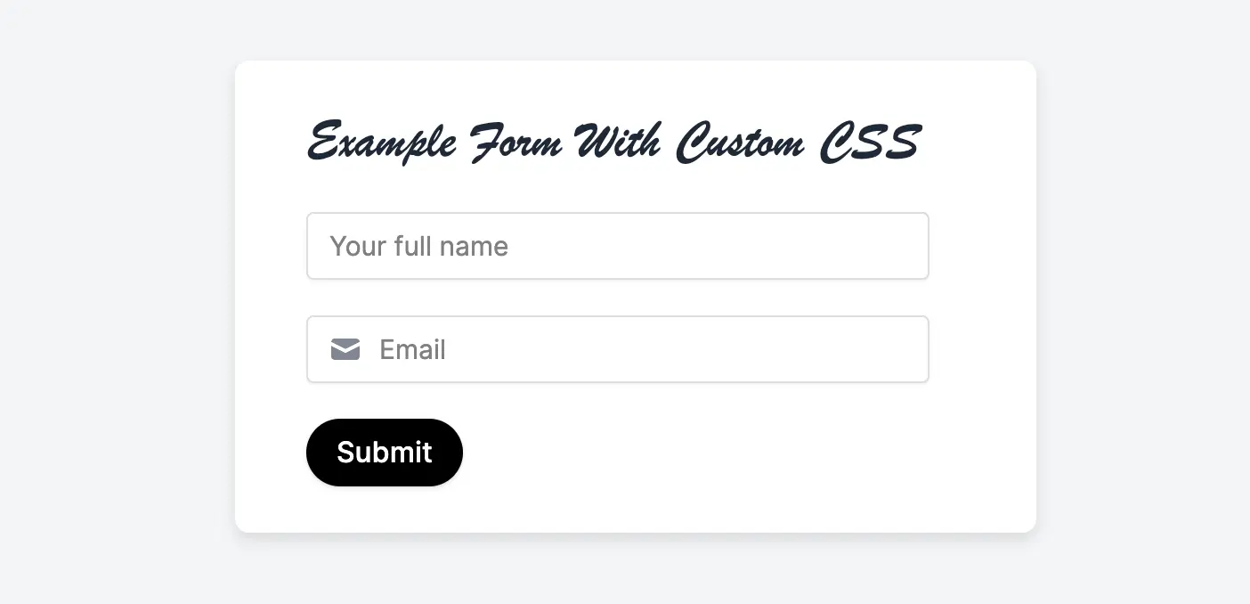
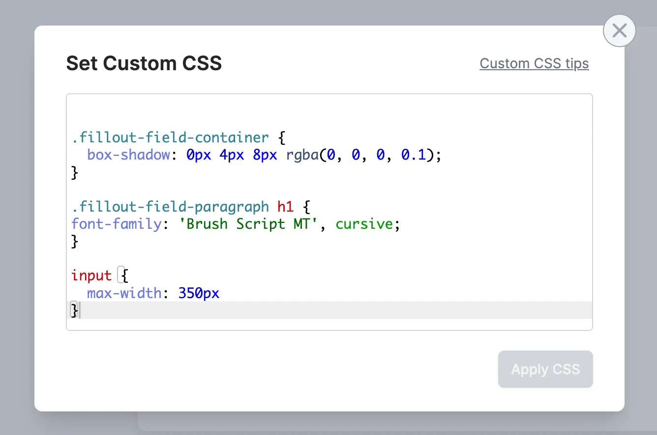
| `.fillout-field-container` | The container for all the fields on each page | `.fillout-field-container { // Add a thicker shadow box-shadow: 0px 4px 8px rgba(0, 0, 0, 0.1); // Decrease width of form max-width: 450px; }` |
| `.fillout-field-[field-type] Examples: .fillout-field-short-answer .fillout-field-dropdown` | Target specific field types | `// Change the width of short answer fields .fillout-field-short-answer input { max-width: 350px; } ` |
| `.fillout-field-button` | “Next” button | `// Make the “next” button rounded .fillout-field-button button { border-radius: 100px }` |
| `.fillout-back-button` | Back button | `// Change the back button background color .fillout-back-button { background: blue; }` |
| `.fillout-skip-button` | Skip button | `.fillout-skip-button button { background: black; border-radius: 10px; color: white; }` |
| `.fillout-field-label` | Field labels | `// Change question labels to green .fillout-field-label p { color: green; }` |
| `.fillout-caption` | All field captions | `// Change captions to red .fillout-caption p { color: red; }` |
| `.fillout-field-text (Heading) or .fillout-field-paragraph (paragraph)` | Heading and paragraph fields | `// Make h1 size text in paragraph field have different font .fillout-field-paragraph h1 { font-family: 'Brush Script MT', cursive; }` |
| `input[type="text"]::placeholder` | Placeholder text | `// Change placeholder color input[type="text"]::placeholder { color: gray; }` |
| `.fillout-edit-mode .fillout-live-mode` | Target edit or live (preview + published) mode of your forms | `// Hides all field labels in live mode of the form .fillout-live-mode .fillout-field-label p { display: none; }` |
| `.fillout-required-asterisk` | Required asterisk \* | `// Only changes in preview/live mode, not in the editor .fillout-required-asterisk { color: black; }` |
| `.fillout-login-profile` | The profile icon in the top right corner that lets users logout of “login” forms. | `.fillout-login-profile { display: none; }` |
| `.fillout-theme-logo` | Your logo, added via theme | `.fillout-theme-logo { display: none; }` |
| `.fillout-error-validation-message` | Validation error message | `.fillout-error-validation-message { color: black; }` |
**Can’t find the class you need?** Let us know at [support@fillout.com](mailto:support@fillout.com) and we’ll add it!
## CSS variables you can use
You can use the following CSS variables (CSS custom properties) to customize specific styles of your form.
All CSS variables should be set on the top level of your custom CSS i.e. outside any CSS class block.
| CSS Variable | Element | Example |
| ------------------ | ------------------------------------ | ------------------------- |
| `--radio-size` | Size of radio buttons | `--radio-size: 48px;` |
| `--radio-dot-size` | Size of the dot inside radio buttons | `--radio-dot-size: 36px;` |
## Adding multiple fonts with Custom CSS
You can also use custom CSS to have different text in your form use different fonts. For example:
```css theme={null}
/* Target Heading and Paragraph Fields */
.fillout-field-text h1, h2,
.fillout-field-paragraph h1, h2 {
font-family: 'MyCustomFont', Inter, 'Helvetica Neue', Helvetica, Arial, sans-serif;
}
```
Here, we’ve targeted specifically the H1 and H2 headings in our form with our custom font, while the rest of the text will follow the font chosen on the theme of the form.
To import the fonts into the form, you’ll need to use the [custom code feature](/custom-code) to insert the font-family snippets, e.g.:
```css theme={null}
```
## Custom code guide
If you want to add custom code to your form, like a JavaScript snippet or HTML div, there are two options:
Display testimonials, banners, or any static object.
Add custom code to inject analytics tracking scripts.
## CSS classes you can use
These classes make it easier to target elements in your form. In general, these are the class names you should rely on (as opposed to other internal class names which may be subject to change).
| CSS Class | Element | Example |
| ------------------------------------------------------------------------------------------- | --------------------------------------------------------------------------------- | ---------------------------------------------------------------------------------------------------------------------------------------------- |
| `.fillout-field-container` | The container for all the fields on each page | `.fillout-field-container { // Add a thicker shadow box-shadow: 0px 4px 8px rgba(0, 0, 0, 0.1); // Decrease width of form max-width: 450px; }` |
| `.fillout-field-[field-type] Examples: .fillout-field-short-answer .fillout-field-dropdown` | Target specific field types | `// Change the width of short answer fields .fillout-field-short-answer input { max-width: 350px; } ` |
| `.fillout-field-button` | “Next” button | `// Make the “next” button rounded .fillout-field-button button { border-radius: 100px }` |
| `.fillout-back-button` | Back button | `// Change the back button background color .fillout-back-button { background: blue; }` |
| `.fillout-skip-button` | Skip button | `.fillout-skip-button button { background: black; border-radius: 10px; color: white; }` |
| `.fillout-field-label` | Field labels | `// Change question labels to green .fillout-field-label p { color: green; }` |
| `.fillout-caption` | All field captions | `// Change captions to red .fillout-caption p { color: red; }` |
| `.fillout-field-text (Heading) or .fillout-field-paragraph (paragraph)` | Heading and paragraph fields | `// Make h1 size text in paragraph field have different font .fillout-field-paragraph h1 { font-family: 'Brush Script MT', cursive; }` |
| `input[type="text"]::placeholder` | Placeholder text | `// Change placeholder color input[type="text"]::placeholder { color: gray; }` |
| `.fillout-edit-mode .fillout-live-mode` | Target edit or live (preview + published) mode of your forms | `// Hides all field labels in live mode of the form .fillout-live-mode .fillout-field-label p { display: none; }` |
| `.fillout-required-asterisk` | Required asterisk \* | `// Only changes in preview/live mode, not in the editor .fillout-required-asterisk { color: black; }` |
| `.fillout-login-profile` | The profile icon in the top right corner that lets users logout of “login” forms. | `.fillout-login-profile { display: none; }` |
| `.fillout-theme-logo` | Your logo, added via theme | `.fillout-theme-logo { display: none; }` |
| `.fillout-error-validation-message` | Validation error message | `.fillout-error-validation-message { color: black; }` |
**Can’t find the class you need?** Let us know at [support@fillout.com](mailto:support@fillout.com) and we’ll add it!
## CSS variables you can use
You can use the following CSS variables (CSS custom properties) to customize specific styles of your form.
All CSS variables should be set on the top level of your custom CSS i.e. outside any CSS class block.
| CSS Variable | Element | Example |
| ------------------ | ------------------------------------ | ------------------------- |
| `--radio-size` | Size of radio buttons | `--radio-size: 48px;` |
| `--radio-dot-size` | Size of the dot inside radio buttons | `--radio-dot-size: 36px;` |
## Adding multiple fonts with Custom CSS
You can also use custom CSS to have different text in your form use different fonts. For example:
```css theme={null}
/* Target Heading and Paragraph Fields */
.fillout-field-text h1, h2,
.fillout-field-paragraph h1, h2 {
font-family: 'MyCustomFont', Inter, 'Helvetica Neue', Helvetica, Arial, sans-serif;
}
```
Here, we’ve targeted specifically the H1 and H2 headings in our form with our custom font, while the rest of the text will follow the font chosen on the theme of the form.
To import the fonts into the form, you’ll need to use the [custom code feature](/custom-code) to insert the font-family snippets, e.g.:
```css theme={null}
```
## Custom code guide
If you want to add custom code to your form, like a JavaScript snippet or HTML div, there are two options:
Display testimonials, banners, or any static object.
Add custom code to inject analytics tracking scripts.