Overview
Building multiple apps and landing pages for the same company or brand requires staying within brand guidelines to ensure a consistent look and feel across everything you create. Without a shared system, it can be difficult to keep colors, fonts, and styling aligned across different projects. A brand kit helps solve this by keeping your key brand elements in one place so you can easily apply them across all apps and pages.What is a brand kit?
It’s a centralized hub containing the visual styling elements that represent your brand. It contains the following:- Logo: The primary visual symbol used in app headers and nav bars
- Icon: A small square logo used as favicon and app icon
- Font: The main text style
- Color Palette: Primary and secondary colors, including accents if any
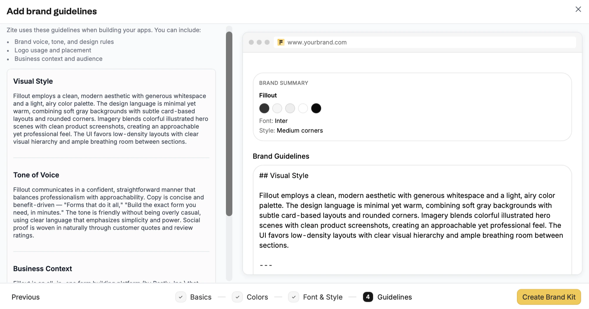
- Guidelines: A set of rules that define how a brand should look and be presented
Build your brand kit
Choose how to set up
From the dashboard, click followed by 
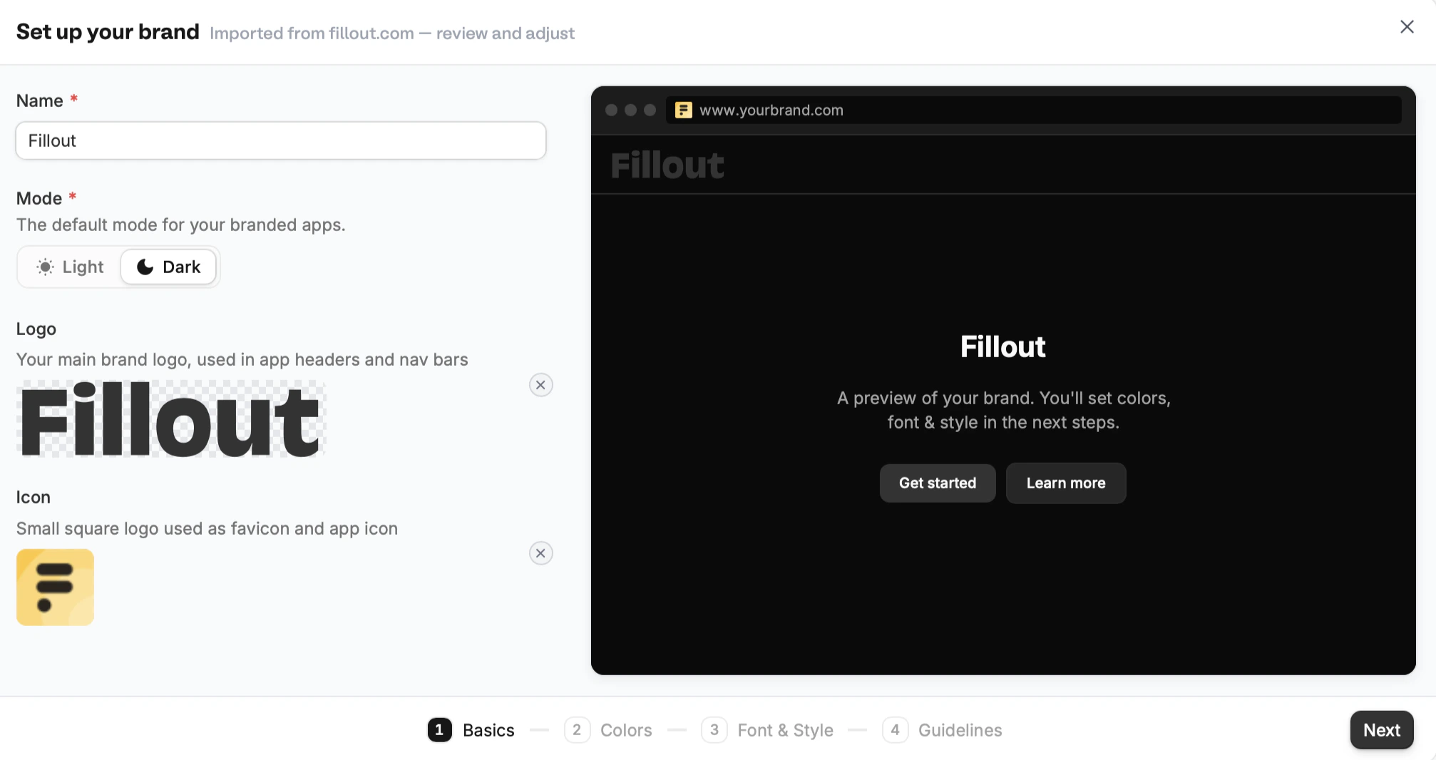
Create brand kit. Alternatively, you can open the Branding kit settings.Import your website or Create manually. For our example, let’s use Fillout’s website.Add or edit your brand assets
Importing will automatically capture a website’s brand information and styling.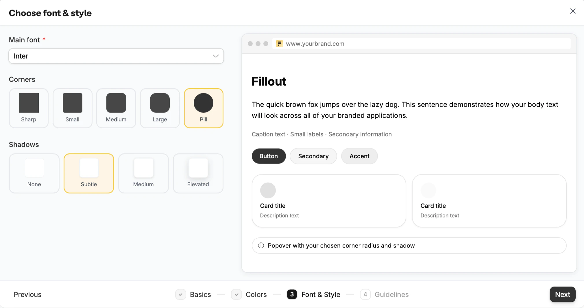
Edit an existing brand kit
On the dashboard, click yourAccount name followed by Settings.
Navigate to Branding kit and click your brand to edit it.
