Improve the accessibility of your forms

Optimize your forms to be understandable and navigable for all members of your audience.

Overview

Accessible form design covers a wide range of language, design, and technical choices. Although the Fillout team continues to incorporate accessibility best practices into our default settings, some accessibility improvements can only be implemented by you.

Getting started with accessibility optimization

People with visual, auditory, and cognitive accessibility needs use assistive technologies such as screen readers, screen magnifiers, and keyboard-only navigation to interact with websites and web applications.
 
Many accessibility optimizations are fairly technical, involving how a page's underlying HTML is structured and written. Fillout takes care of many of those improvements for you. All our forms should be navigable by keyboard only (although there are some keyboard shortcuts specific to certain screen readers that we are still working on), and ARIA labels should be automatically applied to all form elements by default.
 
However, how you arrange and configure form fields and media on the page can significantly impact accessibility. The accessibility recommendations below are those that we have found to be the most important and easiest to implement when building forms.

Improve form accessibility with design and layout settings

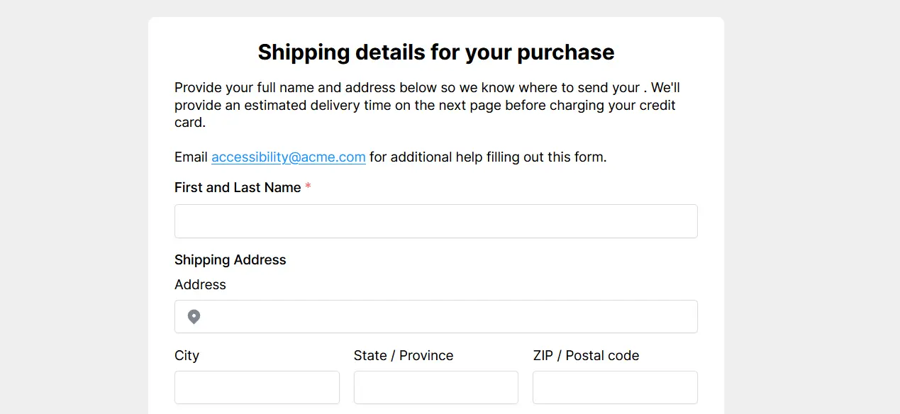
Only use multi-column form layouts when all fields in a single row are closely related to each other (e.g., city/state/zip or day/month/year). When fields with weaker associations are placed next to each other, users (and sometimes screen readers) move from field to field in the incorrect order (e.g., moving from left to right or down one column and back to the top of the next).
 
Another important structural change is to opt for multi-page forms that group questions by category. Minimizing the number of questions on each page drastically simplifies navigation for screen reader and keyboard-only users. It also creates opportunities to further streamline your form by incorporating page logic that skips unnecessary pages based on user responses.
notion image
WCAG requires that the contrast ratio between text color and background color is at least 4.5:1 (you can check yours with this color contrast tool). Similarly, color should never be the sole means of communicating instructions, errors, or other information that blind and low-vision users would be unable to recognize.
 
Click the Theme button in the upper left corner of your form canvas to style your form and apply WCAG-compliant color contrast ratios. Fillout’s default Plain theme meets WCAG AAA contrast ratio requirements with field labels formatted in a dark navy blue (#374151) and field answers formatted in a slightly lighter navy blue (#4B5563), both contrasted by a pure white background (#FFFFFF), for 10.3:1 and 7.55:1 contrast ratios, respectively. Our Coral, Neon, and Dark themes have similarly high-contrast color formatting.
notion image
 
When adding an image to your form, place a caption beneath it that reads “Above:” followed by a detailed description of the image (Harvard’s alt text guide is an excellent reference). Without the caption, screen readers will have no way to convey information to the user about what the image contains. For embedded videos, always make sure there is a way to turn on subtitles to support anyone with hearing impairments.
 
Finally, on your ending page, let users know that they have successfully submitted the form and provide an option to download or review their responses alongside details regarding what will happen next. Everyone benefits from this, but especially those who have additional obstacles to overcome when navigating and understanding web apps.

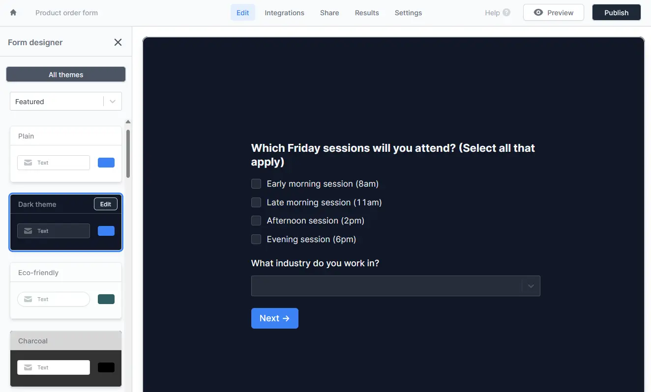
How to write more accessible form questions and instructions

notion image
Add a heading to the top of every form page to tell users what questions to expect. This will reduce the overall cognitive load and provide critical context for those who use a screen reader to understand what’s on the page.
 
Below your page heading, add a paragraph field with succinct, helpful instructions and explanations regarding field requirements and what to expect after clicking the button at the bottom of the page. Depending on your resources and user research, you might also consider adding a way for users to request assistance with understanding and navigating the form.
 
Screen reader users often navigate the page by element, sometimes skipping from one link to the next without reading the text between them. Ensure that users can always discern where a link leads based on the link text alone (e.g., here is unclear, accessibility checklist is not).
notion image
 
When writing questions, describe everything the field requires in the field label (e.g., “First and Last Name” is more precise than “Name”). It’s also a good idea to use bold text wherever possible and increase font sizes so instructions and questions are easier to read for people with low vision.
 
Use consistent phrasing throughout the page (e.g., “What’s your name?” and “What’s your email” vs. “Name” and “Email”) and write in sentence case to make it easier to spot proper nouns (e.g., “Do you use Notion?” is easier to understand at a glance than “Do You Use Notion?”).
 
Caption and Placeholder text is always formatted in a smaller light-gray font that can be harder to read. For the best visibility, keep essential instructions, such as formatting requirements, in the field label. When a response needs to meet certain criteria, make sure to write a custom error message that begins with “Error:” and provides more details regarding validation requirements, including an example of an acceptable response.
notion image
 
When asking Yes-or-No questions, restate what the user is saying yes or no to in the choices (e.g. “Yes, I want to receive a quote from [Company]”). And, in many cases, adding an “I’m not sure” option is helpful for users who struggle to interact with or understand everything included in the form.
 
Watch out for double-barreled or compound questions that ask for two responses but only provide one field. For example, “Will you attend the sessions on Friday or Saturday?” (there should be a Yes/No field for each day).
notion image
 
You can also improve form accessibility by choosing the best field type for the question. For example, Multiple Choice fields work best when there are fewer than five choices, while Dropdown fields are better for five or more choices.
 
Any time users can pick more than one option from a list, make sure to include “Select all that apply to you” in the field label.
 
Conditional logic for questions and pages can improve accessibility by reducing cognitive load and simplifying your form’s flow. Fields that only appear after a user provides a specific answer work with keyboard navigation and are recognized by assistive tools, but it’s always a good idea to test your form with tools like screen readers or magnifiers before publishing.

Manually testing your form’s accessibility

An effective method to evaluate your content's accessibility is to interact with it as individuals with accessibility needs would.
 
After publishing a first draft of your form, turn on grayscale color mode in Windows or grayscale color filter in MacOS (under Accessibility Settings in Windows) and attempt to fill out your form without using the mouse. That will give you an idea of how color-blind and mobility-impaired users interact with your form. Then, open the built-in Windows screen reader Narrator or MacOS’s VoiceOver to navigate your form the way a blind or low-vision user would. The Web Content Accessibility Guidelines (WCAG) provide detailed recommendations for what to look for when evaluating your content.